Project overview
Designing decision clarity in clinical trial systems
UI/UX design · Adobe designathon
We redesigned a clinical intelligence workspace for faster, defensible decisions under time pressure. The sprint centered trust, transparent AI signals, and a calmer hierarchy than typical enterprise dashboards. The full flow was built end-to-end in 10 hours with Hongxin Li under rapid critique loops.
Timeline
10 hr build · April 2026
Role
UX / UI · Strategy
Tools
Figma · Adobe Express · Cursor
Team
Violet Hyun · Hongxin Li
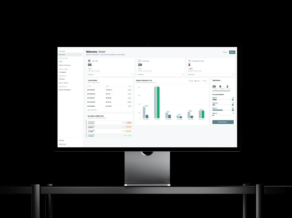
Mockup · High-fidelity hero from the designathon submission. Other sections on this page still use placeholders until export assets are added.
Problem discovery
Amendments cost teams before protocols ship
$43M
avg amendment cost per trial
$20M
estimated preventable exposure
75%
of trials require amendments
Poor benchmarking
Weak baselines inflate risk signals.
No precedent data
Teams guess instead of comparing cohorts.
Opaque AI
Outputs arrive without lineage or confidence.
Our approach
From problem list to design principles
Problems
- 1No defined target user
- 2Unclear goals per workflow stage
- 3Weak product differentiation
- 4Visual system lacked clinical authority
01
Confidence
Users need certainty from dense data, not more widgets.
02
Clarity over depth
Design for decision clarity and trust over feature count.
03
Right signal, right moment
Surface what matters now; guide the next action.
04
Clinical structure
A disciplined system that reads as serious, not consumer.
"Design for decision clarity and trust, not for more features or more information."
Strategy
How do we build the trust?
01
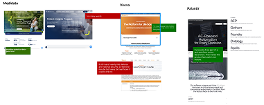
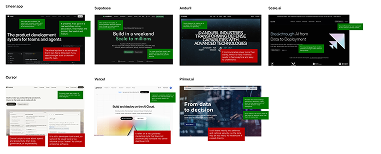
Competitor analysis
Mapped Medidata, Veeva, Palantir, and product references.
Captured strengths and gaps in a structured pros/cons chart.
02
Key insight
Trusted tools show their reasoning.
Palantir, Cursor, and Supabase never hide the machine.
03
Design principles
Surface AI visibly; never obscure how a value was generated.
Give review and override at every sensitive step.
04
Design direction
Sharper borders and teal for AI-augmented zones.
Layouts modeled on analyst tools, not marketing sites.
Outcome
A shared strategy: build trust through structure, transparency, and control—validated with stakeholder interviews and feedback from current users.
UX research
From scan to synthesis to wires
01
Competitor analysis
Mapped references
02
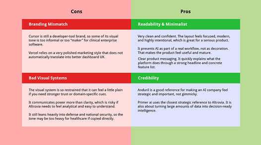
Adobe Express
Pros / cons chart
03
Wireframes
Clinical patterns
Annotated boards
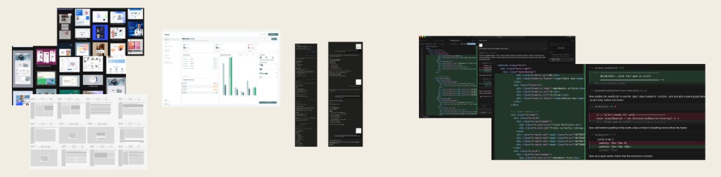
Two annotated scans—clinical enterprise vs. product-marketing references—were reorganized in Adobe Express into the four-quadrant pros / cons chart.
Typography, crops, and callout colors were aligned so both boards could collapse into one legible comparison.
Reference set
Takeaway: the most trusted products show their reasoning—so we tightened hierarchy, surfaced AI lineage, and borrowed navigation patterns from Linear and Palantir.
Visual system
Color and type
Palette
#578186
Altrovia teal
Primary actions
#EAEFF0
Teal light
Nav / hover
#F7F8FA
Surface
Cards
#151819
Dark
Primary text
#6B7280
Mid
Secondary text
#E5E7EA
Border
Dividers
Typography
Display — trial overview
Section header · active module
Button · AI badge · table label
Body copy for dense tables and helper text.
Caption · meta · timestamps
Process
How we built it
01
Moodboard
Figma02
Dashboard
Figma03
MCP revisions
Figma MCP04
Prototype
Cursor05
AI assist
AIChallenge
UI rules drifted across eight pages.
We cleaned up manually in Figma and Cursor—fast, but not perfectly consistent without a final audit pass.
Design challenges
Where the sprint got hard
01
Understanding real user needs
No direct access to end users.
- Deep pass on the existing product and company context.
- Structured questions to Chris on goals and pain points.
- Used stakeholder input as a proxy for interviews.
02
Maintaining UI consistency
AI speed without precision.
- Ran batches through Cursor to auto-fix drift.
- Still needed manual polish on edge spacing.
- Good enough workflow, not a perfect pipeline.
User feedback
What we heard
Emily Shen
NYU alum · Product designer, Palantir
"Rounded corners feel too sales-y. A serious clinical product needs sharper borders for authority."

Key feedback
- Sharpen corners and grid rhythm.
- Borrow analyst-grade density.
- Reduce decorative chrome.
Christos
Altrovia AI
"The dashboard should read as a portfolio: clients see status and risk at a glance."
Key feedback
- Stronger emphasis on active trials.
- More visual hierarchy than tables alone.
- Client-ready overview first.
Final UI
Seven core screens
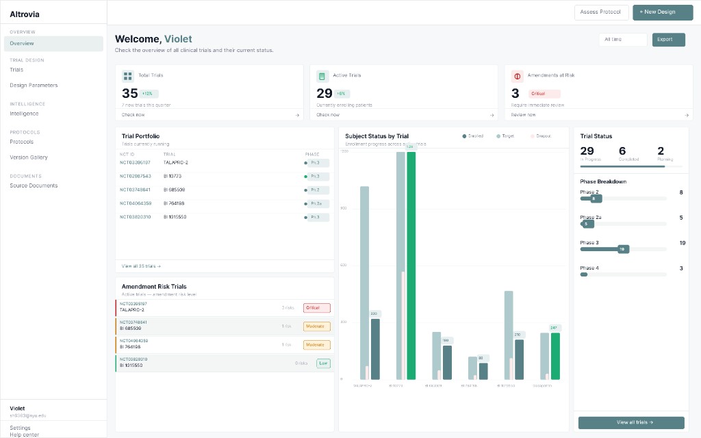
01 · Workspace
Overview · trial cards · new trial CTA
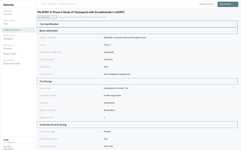
02 · Design parameters
AI badge · collapsible rows · label/value rhythm
03 · Run analysis
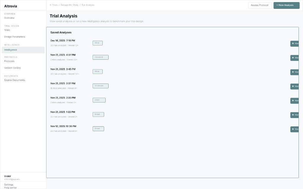
Saved runs · scope badges · timestamps
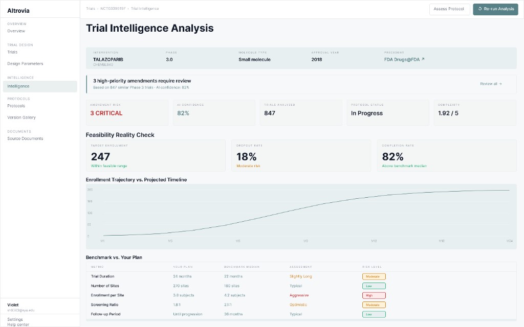
04 · View results
Comparator table · amendment callouts
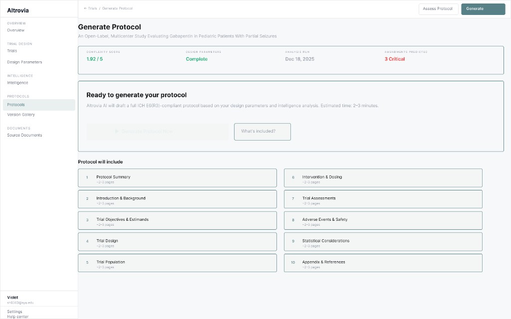
05 · Generate protocol
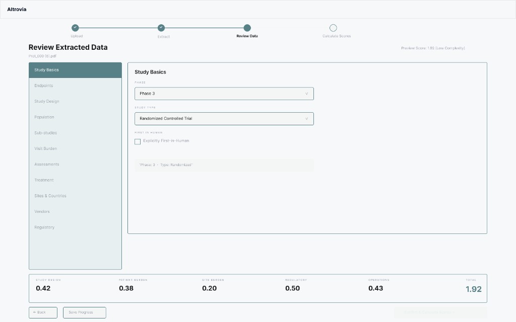
Status bar · ten sections · readiness CTA
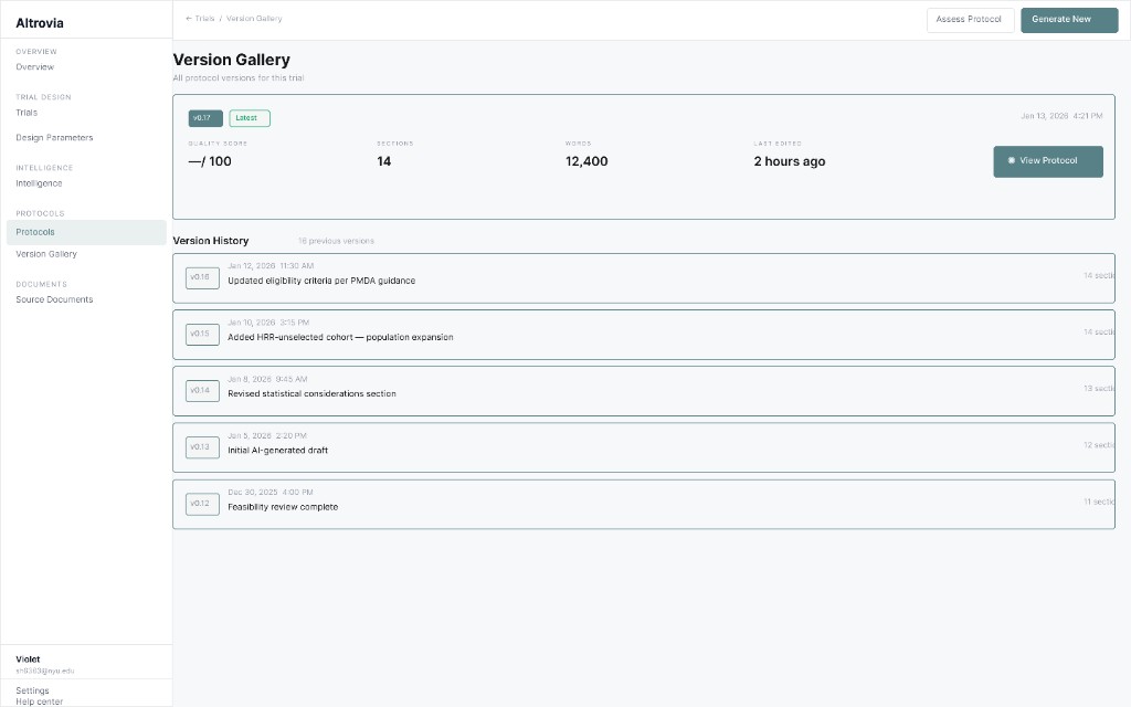
06 · Version gallery
Latest draft · history notes
07 · Complexity assessment
Wizard · review · score bar
Demo
Prototype walkthrough
Reflection
What we fixed
We closed the biggest trust and layout gaps first: clearer AI provenance, consistent sidebars, and scanning patterns that felt clinical instead of consumer.
AI trust was invisible
Added extraction badges and source callouts on parameters.
Sidebar overlap
Rebuilt footer alignment across sidebars in one coordinated pass.
Consumer tone
Shifted to sharper borders after Palantir-informed critique.
Hard-to-scan parameters
Collapsible rows with muted label vs. dark value.
Reflection
If we had more time...
Design consistency
Full grid audit for spacing and alignment across every screen.
Landing page
Stronger clinical value story with real marketing visuals.
User testing
Sessions with trial ops to validate AI trust patterns.
Dashboard visuals
More emphasis on active trials and status, beyond tables.
It was also our first time taking a designathon from building wireframes to mockups, and we worked really hard and I am proud that we still brought something we felt good showing. When everything moves this fast, you try to use AI efficiently, not just to skip the hard thinking. I know more tight deadlines will come in real-life work settings, and this felt like good practice for that.
Continue
View all projects